The problem with reading an actor’s art, is that because they basically live out other people’s lives on film,
it’s tough to tell which reality come from the memories of their movies, or from their own.
-Gregory Thomas
_________________
(Clarice walks into a bar…and a chair…and a cannibal…)
_______________
Note: this is an old recording, and so I referred to the day as Tuesday
__
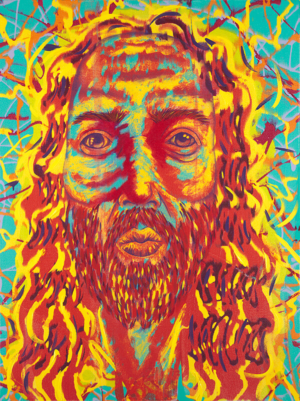
Hey buds! It’s your Favorite Uncle ever, Gregory Thomas here! More art talk for you buds! Here, we’re analyzing Infamous Silence of the lambs actor, Anthony Hopkins. You know him, bud! ^~^ That creepy actor that’s famous for starring as Hannibal Lector! Here it goes, art talk! ______________
(Tony (Self-Portrait), Anthony Hopkins)
__________________________________________
According to artbrokerage, Anthony Hopkin’s art medium is Acrylic on Paper. Looking at his artwork and judging from experience as a painter, I can tell that he’s an expressionist; and with all expressionist, it’s not form you paint that really matters (as in how realistic we can get the art) but how we can get others to feel what we were experiencing.
Like many expressionists before you; Van Gogh (arguably, I personally think he’s more impressionist/expressionist), Edvard Munch, and many others,
Anthony Hopkin’s art’s colors tell you how you should feel. If it looks dark, usually an expressionist artwork hold a meaning about something dark. Briefly discussed, was how I found a correlation between an artist who paints eyes, and the link between narcissism.
It’s no secret that your Favorite uncle EVER, is narcissistic himself. *nuc* *nuc* *nuc*
(The Ranger, Gregory Thomas (2021)
________________
I also paint a bunch of staring portraits. I haven’t really gone in and analyzaed whether it could be a possibility; I make this claim because as an artist trying to hide a pair of staring eyes in their art, its no secret that by putting great emphasis on the eyes, they are dubbed as very important, kinda like how being seen is very important perhaps to the artist.
And as an actor, Anthony no doubt wants others to see him and pay him great attention.
But that’s just a theory.
(Vaudeville, Anthony Hopkins)
___________________
No as far as his artwork, and his abilities as an artist, I’m just going to tell you the truth: his work leaves a lot to be desired. With his works its a hit or miss, and the reason why I say this is because of how hard it is to sense a direction of where he is going with an artwork.
Such as the one above here, he uses a bright red, but he adds in a bunch of other colors that don’t exactly keep a theme, and thus as an expressionist piece, its tough for viewers to know how they should feel.
Here look at how famous artist Edvard Munch paints the Scream
(The Scream, Edvard Munch. 1893 )
________________________________
Notice how Edvard’s colors are able to be consistant; as in no turquoise hurled in where it don’t make sense, here not at all—this is because bright colors that don’t help with the emphasis of the mood could throw off the message.
===
You see Anthony Hopkins, is an actor. With artists painting their art, they paint from their feelings, experiences, in a way that’s consistent.
But with Anthony being an actor, his memories might also be conjoined with memories and experiences in the many roles he played in movies.
(Ballet on the Moon, Anthony Hopkins)
_______________________________________
As is seen here with his Ballet on the Moon, here its hard to see where Anthony was coming from, even in the name alone.
There is no moon, and what we’re greeted with are random images and an even randomer color schema.
Ft.com, another site reviewing his artwork had this to say about it:
“One painting, Ballet on the Moon, features a menagerie of animals, including a pink elephant with flirty eyelashes, gathered around an old man’s head, perhaps a reference to an outing he had with his grandfather to the circus in Port Talbot in 1947.”
====
This is what ft has to say about the site; I wanted to quote what they said, so that I don’t put words in people’s mouths.
“I dream that I’m back there a lot of the time. I spent some time there last year, doing a documentary on my time in Wales and toyed with the idea of maybe returning.” (ft.com)
again, this is quoted from ft.com.
That’s their words.
So, with that said, still looking at Anthony’s quote, and then lifting our heads to look back at Anthony’s artwork, you don’t see any of those good memories that he’s talking about.
You see dark, and foreboding colors—it almost looks like a dark character like Hannibal Lector made this artwork.
And so, what we have to grab from the art, is that they are Anthony’s memories! He paints several different scenes that might come from his acting days.
===
Now, it’s time to use dream analysis to find out what Anthony was thinking when he made his art. It works people. It just works.
According to crystalclearintuition.com,
ELEPHANTS: Elephants show up in dreams as a symbol of power, wisdom, facing obstacles, luck, stability, and social connections. Dreaming of an elephant often brings up big issues in life that you cannot ignore. These issues may be overwhelming you, or they may be big life decisions that can determine your future.
___
The thing that I found most interesting, is that the elephant is pink, like where the music notes are. PINK is usually associated with feminine health, nourishment, and such. Perhaps the pink elephant represent Anthony’s own mother?
===
Nolahmattress.com says that DOGS symbolizes generosity, loyalty, protection, and intuition. They bring knowledge of the self to awareness while bringing comfort, protection, and sometimes warnings. They have come to your dream to guide you on your path in life
___
Again, this artwork by Anthony is very personal to the artist, and holds his memories. As an old timer, he probably has a bunch of experiences, and perhaps if his memories are strong enough, he thinks about his childhood a lot!
Dreamencyclopedia.net says an OLD MAN represents forgiveness for past mistakes. This dream can also mean that the dreamer has completed a long emotional journey.
===
Now what that said emotional journey is, only Anthony Hopkins would be able to say.
Thus, the symbolism shows Anthony as just as mysterious as his roles in movies. He’s not exactly an open book character, is he? WEll, his artworks also represent that, by how tough it is to grab a hold of the meaning.
Jim Carrey’s artworks were also a bit tough to read at times, and this might be because, as actors, they can be given their memories on screen—however those memories might wind up having a lasting impact on how their subconscious views their memories. Are they reliving their own, or the ones they portrayed on the big screen?
===
Thelist.com says BLUE BIRDSsymbolize your goals, aspirations and hopes. If birds are chirping or singing in your dream or if the birds are flying free, this represents joy, harmony, balance, and love. It means you might be experiencing spiritual freedom and liberation.
Last but not least, there are music notes:
According to dreams.metroeve.com, MUSIC NOTES represents feelings about yourself noticing exactly how something feels.
Not sure what any of that means. But there you go!
===
So, again, honestly, hard for me to decipher Anthony Hopkin’s artwork, as this work may be personal to him. I’m sure if he were in front of me or something, he’d be able to explain, am I right? 😉
Too bad I’m too poor and unknown for that.
Now he’s done many other works, but I think you got the jist of them all, no doubt I may or may not go in and share more dream analysis and symbolisms of his artwork, but for not, happy trails buds! All References are at the bottom of the blog buds! Trust me they there, shawty. If not, let me know and I’ll glady hurl them in for you.
==
-Sincerely, Everybody’s Favorite Uncle, Gregory Thomas
Hey buds, it’s Gregory Thomas, your Favorite Uncle Gregory Thomas! I ask you fellow artists, is selling your art in galleries worth it? 20 Year Art Veteran Kevin Hayler seems to think not. Here, I read you what he says from his blog! Won’t that be fun! Let’s discuss together whether trying to get into an art gallery to sell you art worth it or not. Enjoy!
There, now wasn’t that GROOVY? ^~^
(‘Leaps and Bounds’ Printed from a Drawing by Kevin Hayler)
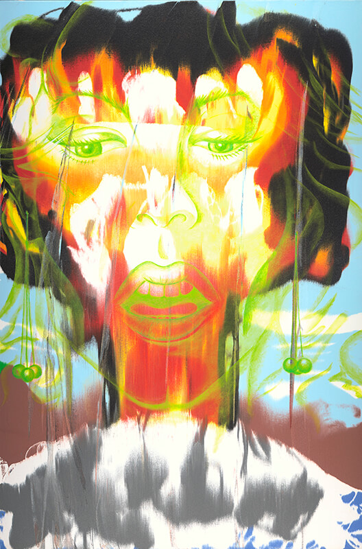
Hey buds, Everybody’s Favorite Uncle, Gregory Thomas here! Not many dudes and dudettes know about Jim Carrey’s artwork; looking at his artwork, and analyzing it, you can get a sense of this multi talented comedian’s mysterious side! Jim Carrey’s Abstract Expressionist works of art, and clever sculptures are very impressive, and impactful!
Today, in this awesome special podcast, we analyze Jim Carrey’s artwork using dream analysis and color interpretation! Now! Let’s get started, but first before you hear from me buds! Why not hear it from the genius himself!
He talks about his art right here, and here you go bros and ladies!
(Jim Carrey discusses his passion for art, starting all the way back from when he was a youngblood!)
Now, all of what you see here? The quotes, the energy, the happiness, joy, pain, and deep intuition? All of these things, are seen right here. Inside Jim Carrey’s works of art. Using dream and color analysis, you can see and read everything in Jim Carrey’s mysterious artworks!
Now, this is just a couple of scenes and clips, as I’m sure we can hurl a HUGE bunch more clips of the cat in action!
But you came here for the art he do. Am I right?
Now, let’s get started!
____________
(Hooray We Are All Broken, Jim Carrey) _____________________________________ “So-called reality is energy and color creating forms that rise out of nothing. Broken figures dancing for each other filled with pain and polkadots, sharing one frequency, yet believing they are seperate.” – Jim Carrey ==========
Now looking at Jim Carrey’s first art work here, Hooray We are All Broken, you can see the energy behind Jim’s work. In fact, just by looking at his artwork, I can already see the traits of his bipolar condition, simply by how the color schema seems to bounce back and force between anger, energy, dread, and passion—-the red refleces his passions, angers, and drives, but then again the yellows also seem to be a commonly chosen color by Jim, and perhaps reflect energy and movement! Though because his artwork is very abstract, and there really isn’t any ‘objects’ other than the impression of people shown here in the grey, there isn’t much a dream dictionary reading on his artwork will be able to give us. That means, most of his art can be read using color analysis (taken from Color-wheel-pro.com) For this one: ____
RED: Red is the color of fire and blood, so it is associated with energy, war, danger, strength, power, determination as well as passion, desire, and love. And so the red Jim Carrey used probably reflects both his passions, and anger and desires.
YELLOW: Yellow is the color of sunshine. It’s associated with joy, happiness, intellect, and energy. And so the yellow here is not just a positive color for Jim Carrey, its what I would call a ‘liberating color’ for him. It resembles Jim Carrey’s energy, his passions, and his drives, just as personally as the use of red here does.
GREEN: is the color of nature. It symbolizes growth, harmony, freshness, and fertility. Green has strong emotional correspondence with safety. Dark green is also commonly associated with money.
Green is also an important personal color for Jim Carrey here, and might reflect positive earthly energy as well.
The grey might be symbolic of his depressed stages that come from his Bipolar diagnosis, however the red inside him (the red lines in those grey people depictions), may reflect times of passion, anger, and perhaps sometimes pain.
There are other colors here, but I think this is the jest of what is being emphasized in Hooray We Are All Broken, Jim Carrey, and no doubt that here this partcular work of art not only reflects his emotions, but for other viewers on the outside looking in, their Jim Carrey’s responses to them about how others might deal with whatever life throws at them as well.
________________
(Electric Jesus, Jim Carrey) ___________________________
“Growing up catholic Jesus was a powerful and pivotal figure in my life. Whether his story is literal or allegorical, I have no doubt of the power of Christ consciousness. My intent was to capture that power, energy and ultimate understanding as it manifests from the electricity in all things. For The Prince of Peace to gaze into your eyes and see everything you are with total acceptance, forgiveness and love.” – Jim Carrey
===
Electric Jesus is Jim Carrey’s way of expressing his beliefs to others about his views of not just religion, but more than likely his views on how religion should be treated; a positivity of uplifting emotions, in where one is being constantly filled with energy, and movement.
You gotta remember for him being Bipolar, the death of life is the absence of movement (because no doubt it’d mean somebody stuck in bed all day, am I right?) For Jim being Bipolar, Jesus being seen as bringing high energy and passion is something inspirational to him.
Though for what I’m seeing here; for me as a Christian, when I think of Jesus, I usually think of white, light blue, and the absence of red. Jim has a lot of red here, and even some of the infamous Pain Red that I discussed in one of my other podcast episodes. Many artists, such as Salvador Dalí’s The Face of War, and even Vincent Van Gogh’s infamous Crows and Wheatfields also have this red.
It’s that deep almost burgendy color that you’ll see, usually accompanied almost habitually by the artist with blue and yellow, sometimes black, that an artist will paint whenever they feel a ‘deep pain’ inside, perhaps depression, or a deep longing. Hence, this particular work of art is very, very personal to Jim Carrey.
And as you can see, just like many artists before us Jim’s lean toward using blue and yellow here shows that these are indeed Pain Red colors.
The turquoise color here is an extremely important color; the high energy blue marks high passion and joy.
All in all, “Jesus radiates energy” to Jim! X3
====
RED: is the color of fire and blood, so it is associated with energy, war, danger, strength, power, determination as well as passion, desire, and love.
YELLOW: Yellow is the color of sunshine. It’s associated with joy, happiness, intellect, and energy. And so the yellow here is not just a positive color for Jim Carrey, its what I would call a ‘liberating color’ for him. It resembles Jim Carrey’s energy, his passions, and his drives, just as personally as the use of red here does.
Now, Jim Carrey made mention of Jesus’ eyes; which is pretty ironic, because he painted them PURPLE. PURPLE, was regarded as a very prominent color for people waaay back in Roman times, and Jim Carrey chose to place that royal color in his painted Jesus’ eyes. That means ‘royalty stares back at the viewer’.
However, the eyes are Dark Purple—a foreboding color usually meaning gloom or dread, and according to the color analysis:
DARK PURPLE evokes gloom and sad feelings. It can cause frustration.
All in all, the color palatte chosen by Jim Carrey here, may suggest that Jim has a ‘love, hate’ relationship with Christianity and the concept of God. Perhaps it can be both at the same time, or perhaps the gloom may be just in the concept that a Great Being watching us, and potentially judging every move we make might seem a bit disconcerting to Jim.
___________________________
(Shes The Bomb, Jim Carrey –I can’t seem to find the date for his artworks ;( ) ________________________________________________________________________________
Now this one is a very beautiful work by Jim Carrey! Also, this particular work seems to be very personal to him, in where most artists are more or less like an open book, showing you what they feel about the world, this one done by the man behind Ace Ventura, seems to be like a memory collage of things current to him.
Now, we’re seeing a hint of surrealism, and then what appears to be the image of what the world sorta looks like in his artwork.
Now, first, notice how Jim Carrey doesn’t paint too many outdoor scenery pics.
This might not be intentually, but subliminally.
You see from my other podcast, where I talked about hermit painters, and if you can tell if they ‘got out much’, notice how Jim Carrey in one of his videos said that he would usually stay cooked-up in his room all day?
Because Jim Carrey doesn’t really paint an outdoor presence, you can tell just by looking at his artwork, that he doesn’t get out much! XD
What’s important to us is not the scene outside—no that’s what Jim Carrey is trying to shut us out of—no, see, the emotions are what’s important. The energy! The feelings. These are what Jim wants to express to us.
RED: is the color of fire and blood, so it is associated with energy, war, danger, strength, power, determination as well as passion, desire, and love
And notice, the presence of black? Black and white? Black and white are what I like to call “Dread colors” in where they survey feelings of dread, of even sometimes fear.
Depending on how the color of black is used could either mean strength, or fear. Sometimes it could even mean peace or rest, but usually black is always seen as a foreboding color.
===
YELLOW: Yellow is the color of sunshine. It’s associated with joy, happiness, intellect, and energy. And so the yellow here is not just a positive color for Jim Carrey, its what I would call a ‘liberating color’ for him. It resembles Jim Carrey’s energy, his passions, and his drives, just as personally as the use of red here does.
GREEN: is the color of nature. It symbolizes growth, harmony, freshness, and fertility. Green has strong emotional correspondence with safety. Dark green is also commonly associated with money.
Now HERE, we see some objects that we can use Dream Analysis on!
Let’s look at some of those things, shall we buds?
==
Now just as discussed before, though its supposed to be used on dreams, dream analysis can also work on artowrk as well (it all comes from the subconscious) as you’ll find that nothing an artist applies to paper can be hid. In fact even an somebody trying to ‘hide’ something can be seen that they were trying to hide something by looking at both the color and objects painted in an artwork.
WOMEN are a very unique symbolism that more than likely usually always reflect an aspect of the artist themselves; perhaps because of the explosion here, might not exactly be another person, but perhaps just as a female subject might be mad because needs weren’t being met, he too, was feeling angry because he felt needs weren’t being met.
Only Jim would know what I’m talking about here, as this is where my analysis needs his explanation on.
===
Seeing a woman’s face clearly can mean there is much stress in your waking life.
However, any other interpretation would only be subjective, and so I think we’ll go to the next interpretation:
EARRINGS symbolize reputation, success, new opportunities, increase of income, fortunate circumstances, etc. Dreams about earrings are often a sign of unexpected gains and happiness.
No doubt this means that Jim was thinking about his fame and fortune when he did this work—it all depends on whether he did this when he was famous (more than likely) or when he was a child. If as a child, than this might’ve been considered ‘rage vent’ art, and the face might be subliminal for his mother.
EXPLOSIONS can mean that you have some repressed emotions, thoughts or words that you’ve released lately of feel you are close to letting out.
So, all in all, Jim had some things to get off his chest, no doubt he had some things to tell off whatever other woman Jim might’ve been thinking of.
Now what I’m seeing here in that white mass in the work of art, is what might be Jim Carrey’s mind thinking of a mountain; let’s analyze it that way, and see what we come up with:
IF THE MOUNTAIN IS COVERED IN SNOW in the dream, it is a good sign. It predicts the fulfillment of the goal, even though all the difficulties and obstacles.
No doubt Jim did just that! Being a commercial success, he was able to cope with his bipolar disorder, and still gain the hearts of millions worldwide with his acting, comedy, and talent.
====
And then of course, he’s got some sculptures!
(Ayla, Jim Carrey)
__________________
In this tubularly bodacious sculpture ( ͡° ͜ʖ ͡°), Jim Carrey took great stakes to make sure that he got the boobs right!
Usually when men do this in a work of art; drawing emphasis on anatomical correctness, or perhaps even the overemphasis of that thereof, it means that its a part of the body Jim notices, or something that resonates with him the most.
Now, just like dream analysis on paintings, it should work on sculptures as well!
===
IF YOU SEE AN OPEN WINDOW, there are possible alternatives and new opportunities in your life. It shows that you will have the choice to decide. The dream meaning of an open window also indicates that you are a firm person and don’t give up in the face of adversity.
And so the open window represents that Jim is a firm person, unwilling to give up, and always passionate about his work, be it anything he attempts to accomplish in his life.
WHEN YOU SEE A WINDOW in a dream, it shows that excellent opportunities will come soon. When you only see a window, it can also mean that you are a sensitive person, and you must stay alert. Dreaming with a window also warns you that you should pay more attention to this situation and start acting accordingly with confidence.
No doubt Jim might get discouraged easily? Perhaps his artwork reminds him to never feel discouraged, while staying alert as to what is going on around him.
Now, what Jim artwork wouldn’t be complete, without posting some of his Trump hate art? XD
====
(Trump as depicted as a witch by Jim Carrey)
______________________________________________
Something tells me Jim don’t like Trump XD
But then again besides the Trump Supporters, who does? 😉
Now we have some powerful symbolism here; bearing in mind the infamous ‘down brush strokes—or in this case penwork–that shows that Jim was feeling great dread, whatever he was thinking when he made this art.
===
If you associate WITCHES with evil and destruction and were frightened of the witch in your dream, then perhaps she represented something bad in your life right now.
It’s common knowledge, that seeing monsters, and demons, witches, etc. are a reflection of the dreamer’s own negative personality traits.
And so the fact that Jim Carrey ‘drew’ Trump as The Wicked Witch of the West, means that Trump here reflects all of the things that Jim would consider ‘detremental to purge from his own personality’:
Greed, lust, arrogance, love of money.
All of these things in Jim Carrey’s mind, are what Jim would strive to turn away from, and the fear that he would succomb to the darkside of fame just like Trump did would be behoovering that he’d depict him as a monster in his artwork.
This upsets Jim, as evident in the way he floods his art with ORANGE, a color highly associated with health, and the Downward Van Gogh lines.
Often times, though, FLYING represents a sense of freedom. Sumber explains that flying dreams serve as a sort of escape from the pressures of the real world (which is represented by the ground).
Pretty amazing stuff here buds! That’s exactly the message that I see in Jim’s mind as he paints his work of art here.
OTHER PEOPLE EATING A BANNANA suggests that you will hear news which will make you happy.
Eheheh…Now this reading is a very personal one for Jim… 😉
TO PEEL A BANNANA suggests that you are subconsciously dissatisfied with certain situations in your sex life, but since you are aware of them, your problems probably seem bigger than they actually are.
====
Whoa, okie dokey now! I have so say, for that one, only Jim would know what that mean, amIright?
Well buds! That’s all the stuffs I got for you today! hopefully you will check Jim Carrey’s artwork out! Perhaps it will help you see where he’s comin’ from? Hopefully you’ll look at the dude in a groovy light, and we’ll see some more of his artwork!
His art is a tad bit hard for me to hang in my house, eheheheheh, however I wouldn’t mind maybe one day getting a hold of that Shes The Bomb work! Very stunning stuff indeed!
===
-Sincerely, Everybody’s Favorite Uncle, Gregory Thomas
References
_____________________________
Click here to check out all of Jim Carrey’s art, and even here some GROOVY bios, and other Jim Carrey related stuff!
Jim Carrey Reveals His Mom Was ‘Addicted to Pain Medication’ During His Childhood Slater, George. (2018). Retrieved from URL:
Hey buds! It’s Everybody’s Favorite uncle, Gregory Thomas here! As a college student, no doubt in wake of the HORRIBLY DEVESTATING PANDEMIC, that many are thinking twice as to whether they should invest in college. You gotta pay these dudes after you’re done you know. With the pros and cons of college, I tell my humble opinion on college buds, and why despite the struggle, why you should still go.
Hey buds! It’s your favorite uncle ever! Gregory Thomas here buds! Say dudes, have you ever took a gander on, what potentially could be, “The Funniest Show of the Decade, or perhaps in centuries?” The Mickey Mouse Shorts, if you haven’t heard of them, are shorts made by Disney. What makes this show stand out aside all other show, is that it’s humour is very unexpectidly funny! I’d rival its humour alongside Spongebob SquarePants itself! I’d like to post a HUGE bunch of pics and stuff describing the show like I do, but buds I feels like these shorts here speak for themselves.
What do you think about this EMMY AWARD WINNING show?
Take a gander at these shorts here bro, and see where I’m comin’ from buds! Enjoy!
(Note: This blog buds, is made by adults for adults. though no adult content is here on this page, and yes these shows are for kids, I am posting this as a rebuttle, just so devs are clear. ;))
Now, enjoy!
(Here, o’l Mickey Mouse here can’t contain his fetish for Minnie) Minnie none the wiser.)
I dunno buds, both clips from the two different universes cracked me up! Keep in mind these episodes of spongebob were mainly from back in the day when they were actually funny as hell. Now’adays, Spongebob I would like to say isn’t quite as funny as it used to be.
Okey Dokey okey! Now let’s take a gander at some stills from the two shows, and compare their humor rating (note: none of these are memes, just shorts from the shows–that’d be a podcast blog for another day 😉 😉 😉
Now here’s the Spongebob Meme, which one be funnier?
Yes, ALL of these memes are Spongebob Memes!
Moreover, its best to say that since Spongebob has been out for much longer than the Mickey Mouse “shorts”, I couldn’t really find too many memes centered around Mickey Mouse Shorts. Mickey Mouse has plenty of memes, but I wanted some deriving from the shorts show.
And of course you just can’t beat the severe accuracy or a Spongebob mean to real life.
So, which one is funnier? Y2K is gunna crucify me alongside Jesus, and demand I proclaim spongebob as the funnier one. Xd,
but perhaps to each his own?
I’m not really trying to pick a stand, I just wanted to compare the two humors, and show how very close the Mickey Mouse Shorts are to what could be the funniest show of the decade.
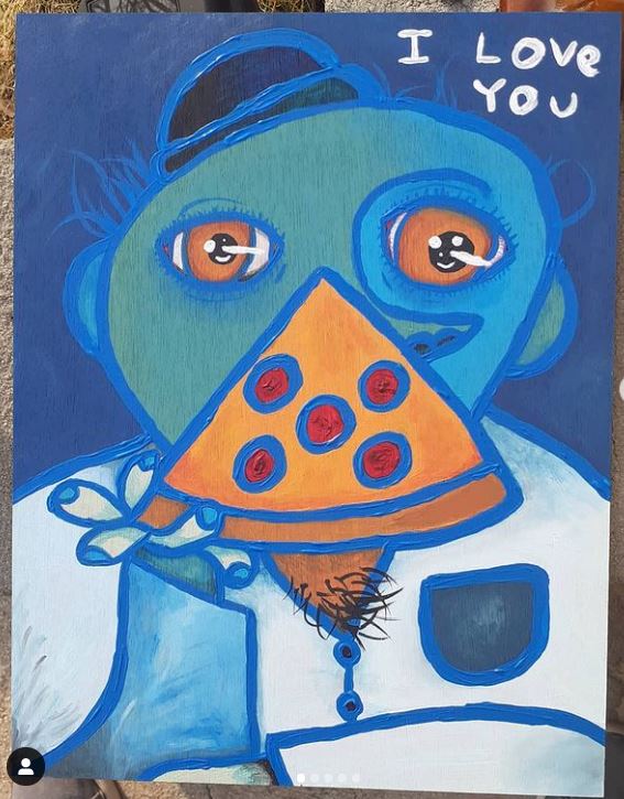
Hey buds! It’s Gregory Thomas, your favorite uncle ever here! Say buds, take a gander at this: Have any of you artists here ever used Cerulean Blue? I have. However, in my experience with this color, I found this to be one of the toughest colors to mix with, as it usually always tries to stay true to its original hue.
Today in this interactive video, I explore what colors react with this infamous blue color!
As an acrylic artist, I ran across a good bit of colors as I paint my paintings, and have made artwork using the color; the colors I mix Cerulean Blue Hue with, usually titanium white, of which I found to be the only color that I can adequately make a decent blend with. Here is the the true definition of the Infamous Untamable Blue, and what it means according to atelieracrylic.com:
“Cerulean Blue Hue is a Series 2 opaque color. It has a masstone of a intense sky blue with a reddish hint, with an intense sky blue undertone.”
While even as an artist I’m still not too sure what opaque means (I know art nerds are gunna chew me up after this one Xd) I found that the Infamous Untamable Blue refuses to accept any color to blend with that doesn’t wind up being too dark, or lean toward mud-mixing. With me generally being a bright and vivid painter with expressionist ideals, I don’t really like the dark and diluted color that mixing the Untamable Blue grants me, however below is one painting that I was able to achieve an adequate sky with by blending a lot of white, and barely any of the blue with:
______________
The White Cherry/ The Overly Concerned Parents #Lennyism painting #2 Gregory Thomas. (2021).
This painting by your awesome favorite uncle here features my use with the Cerulean Blue Hue for the sky (Note: I’m pretty sure the blue eye here was actually made using Thalo Blue, Raw Sienna, and Titanium white, but not the Untamable Blue Cerulean.)
Here in the skies, you’ll notice it has a slight yellow tint; that yellowish tint barely visible is raw sienna—and so the colors I used to achieve that sky were a lot of titanium white, raw sienna, and then a tiny (and by tiny dammit, I mean tiny my good man!) dab of The Untamable Blue. All the colors were from the brand Academy, which I obtained from Michaels. If I were to add even a fingernail sized portion too much, it would completely overtake the pale blue I was trying to achieve, and be much darker than what I wanted.
____
Below here are the colors that I mixed with on the podcast, so that you can see first hand the chaos that The Untamable Blue causes whenever trying to blend with it. Most of these paints were from the Academy brand, and are quite ‘thick and pasty’ in nature, however my podcast explains which paint features a different brand if used. All colors mixed with the Cerulean Blue Hue were of the same sized paint droplet–or at least as best as I was able to do:
_____
(Crimson and Cerulean Blue Hue)
_____________________________________
The Crimson and the Untamable Blue that shant be named here of course would give me a purple-ish color, noticing how both of these colors are dark in nature, no doubt whatever concoction I conjure up from the depths here will give me a dark and foreboding color:
( Crimson and Cerulean Blue Hue mixed together) _______________________________________________ And Lo and behold, I was right! The dark color here gives me a muddish dark plumb tone that is hard for me to find much use for, other than a dark background color, or perhaps a dark dress. Not many things I could use this color for came to mind, and thus I found it hard to do much anything with this birthchild from the infamus blue. ___________________________________________
As a 90s kid, I noticed this color everywhere, especially in those grundgy trip hop movies featured in the late 90s; usually either a jacket or a taxi cab would feature this color at complete random.
The green color that I get here, you’d assume would be a bright color, correct? With Cadmium being so bright, there must be a way that I could retrieve a vivid color to work with?
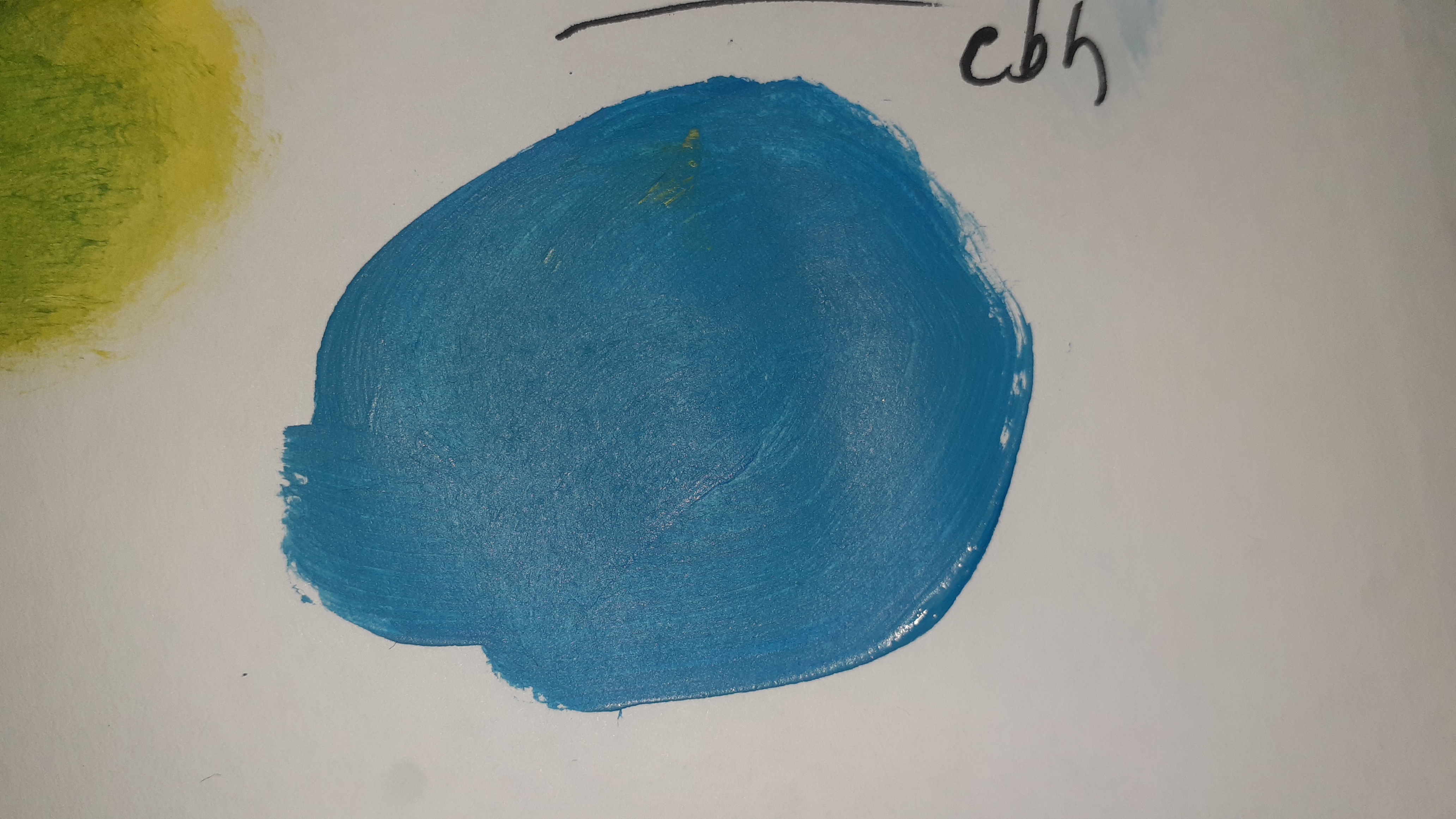
(Cadmium Yellow Medium Hue and Cerulean Blue Hue mixed together)
Mixing the two together I was able to grab hold of a bright green color. This color would make several nice things; with a tropical ocean being one of these things, a woman’s dress, or perhaps an offbeat colored object like a hat.
However no use in the likes of trying to color a tree with it; it’s just too blue, hence, the infamous Cerulean Blue Hue is still trying to make it’s appearance known even over the Cadmium Yellow. Again, very hard to use this color for many other logical objects, unless I were to get creative. The sea would be the only thing I’d use this color on.
Now titanium white is the only color I was able to use to tame the virtually Untamable Blue, but I could only use a tiny bit of the Cerulean Blue. Any more, and the infamous blue would overtake the white, and it would just look like its all the Cerulean again.
(The Same two colors, but mixed with Mars Black)
_________________________________________________
Now in the corner of the next pic, I tried to mix it with Mars Black, to see if I would be able to get a slightly dark gradation—Mars Black is also another color that refuses to bend for other colors, and is hard to mix with—
(Mixed colors the White and Cerulean Blue Hue and Mars Black [Mars Black in the top right corner])
As you can see, the Cerulean Blue Hue still wants to jump out at us, and barely changes in its hue. The Mars Black couldn’t even dilute its blue, and it was tough to get a proper gradation going with the two colors in place.
The Untamable Blue would need a lot more white paint in order to yield to another color. Of course this blue can make several things with a bit of creativity, however a sky color would work best; its color almost mimics my uses of Thalo Blue+Raw Sienna+ and Titanium White, but this time around its much lighter, and yet still holds true to its form.
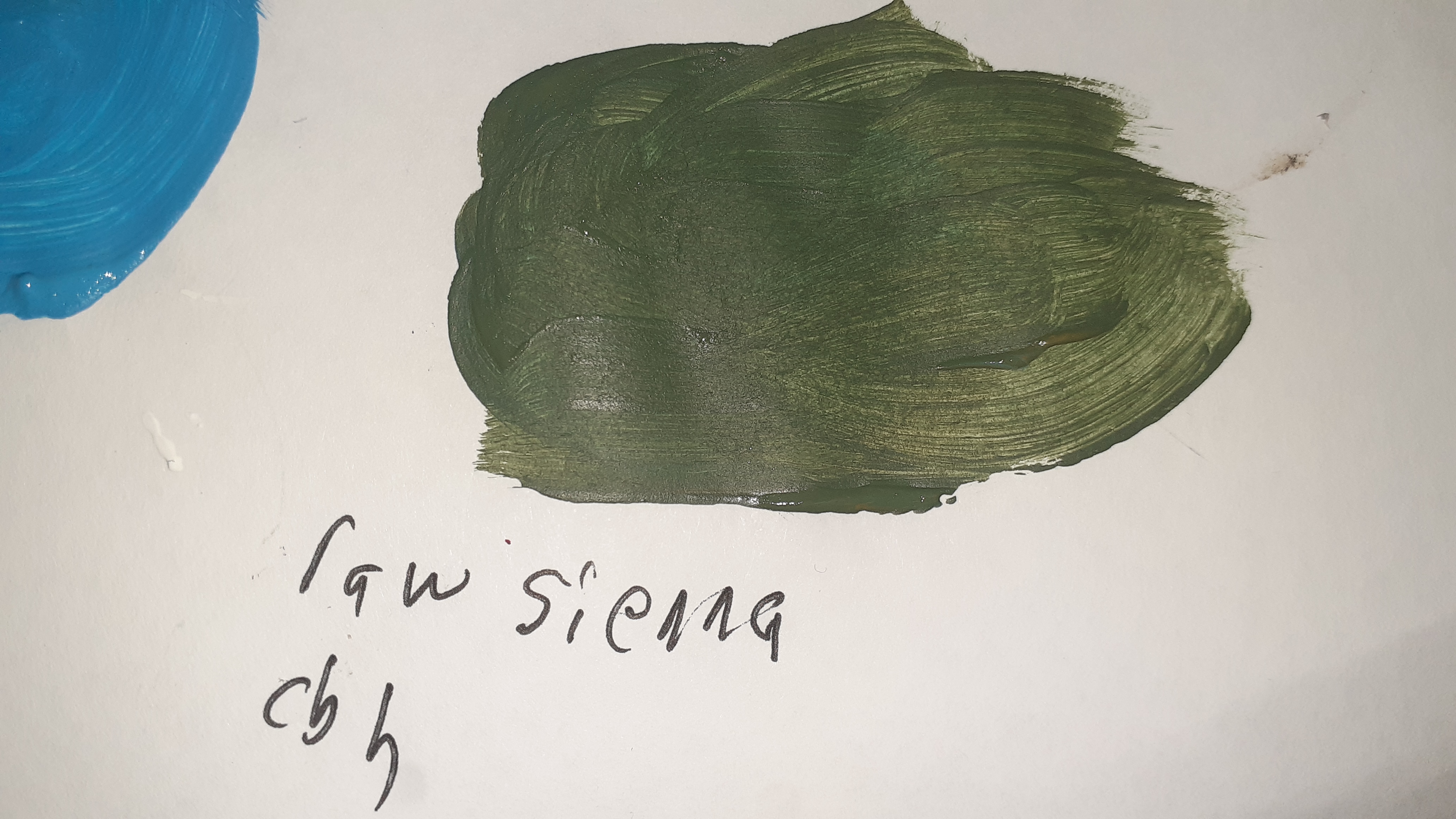
(Raw Sienna and Cerulean Blue Hue)
________________________________________
This time I tried my hat at using my secret ingredient; Raw Sienna. Now Raw Sienna is what I use to make a bunch of colors, but alongside Thalo Blue I’m able to create a very distinctive light blue color that is very pleasing to the eyes. I find that using a pasty Thalo Blue works best for creating the blue I want, but let’s see how the infamous Untamable Blue reacts with my secret weapon:
I was only able to achieve this yucky tree color. The only thing I could use this thing for is a tree. Now I know that you can no longer see the blue. This isn’t exactly what I mean by ‘being tamed’. By tame, I mean by achieving a color that I find to be pleasant enough to paint with when blended with another color. Here suffice to say you don’t see any more blue hue, but this green is a hue that doesn’t really prove much use other than depicting vegetation life across the canvas; no dress, hat, or shoes would be something I’d use this color on, unless once more I were getting creative.
one more for the chuckles:
(Liquitex~Light Pink and Academys’ Cerulean Blue Hue)
Light Pink is a very light color that just gets eaten up by other paints you mix with it, and so no doubt that the Untamable Blue will devour it spot on. I would have to use as much Cerulean Blue Hue paint as the period (literally the period) at the end of this sentence, in order for me to get another color that the Light Pink can stand out in…No seriously this period, right here, at the end of this sentence.
Anything bigger than that would completely kill all of the Light Pink.
I did however find that Cerulean Blue Hue does a groovy job at being used as an outline—such as what I do with Mars Black (I wouldn’t recommend Mars Black, because sometimes its so dark, it can make your outlines too shiny, even after it dries; you may or may not want that).
The Cerulean Blue Hue here, untampered with and straight from the tube, shines out above the other paint so much (even that Thalo Blue background) that its the most vibrant thing on the wood board.
There are many uses that I can get out of the infamous Untamable Blue; a blue that either wants to stay true to its original, or it will destroy your color to look like mud (maybe Cerulean Blue Hue is haunted or cursed…I dunno!).
However, treating it like a caged lion, perhaps you can use its stubborn nature to your advantage?
What do you think buds? Share your thoughts in the comment section below, and if you happen to know what colors blend nicely with it, let me know too, as I want to grab me those colors straight away!
____
-Sincerely, Your Favorite Uncle, Gregory Thomas
Summer’s Day, Berthe Morisot. (1879).
P.S. French female Impressionist painter Berthe Morisot used a Cerulean blue in her artwork; as I can see in that thingy the woman in white is holding…But as we can see, the color is mostly unblended with, and remains in its full form. Even with oil color paint, it seems Berthe only sparingly used the color here and there, perhaps in the lake.
Still it must’ve seemed to prove as an Untamable infamous blue even way back then!
__________________________
Looking to buy my artwork? You can check me out Youruncle_gregpaints right over at Instagram! There you’ll find the bulk of my artwork. If you see any you might like, let me know and we can talk turkey! I paint in cubism, expressionism, surrealism, even nonobjective art. I also have an etsy, however I don’t have many paintings there:
Hey buds, It’s Your favorite uncle, ever, Gregory Thomas! Say buds, take a gander at this screamin’ dude over here. Have you dudes ever saw this character before? Nope? Yes? Well if you have or haven’t, no doubt your eyes will be opened wide to the horrors of eternal struggle! Xue Jiye is a very emotional artist that tends to paint works that seem to be macabre, but if given a bit more of an analysis, we should be able to JUMP in into my buddy here’s intense mind!
This is an Introduction to a follow up video that I’ll be cookin’ up in the near future, just to get your mouths watering for more to come!
Stay tuned buds! -Sincerely, Your Epic Uncle, Gregory Thomas
In the year 2257, humanity as we know it is challenged when an AI threat called The Avalon Republic manages to self-replicate itself. By the hand of the insane mechanical overlords, America and the other countries are put to the test as the green eyed apparatus’ hack our AI powered cars and technologies, clone their mechanical militia, and lay siege to our world in their efforts to turn humans into other machines. The Fight War wages as we send forth boots on the ground with our flags swinging through the air in bulk to defend our world. The fate of all existence lies in our hands…Should we fail, all hope will be lost.
The topic is the psychology behind Bob Ross’ artwork.
Ask yourself, now that you know that Bob Ross was a war vetern. Do you think that the reason he paints trees all the time, is because he thinks about the Vietnam war? A whole forest filled with people might be, subliminally a whole forest probably filled with American and Vietcong soldiers…But a full lush forest not filled with any people presence, could be considered a Utopia. Pure, before the war began.
This indepth Analyses of Bob Ross’ artwork goes into great detail behind his artwork, here’s the introduction to wet your gums and appetite.